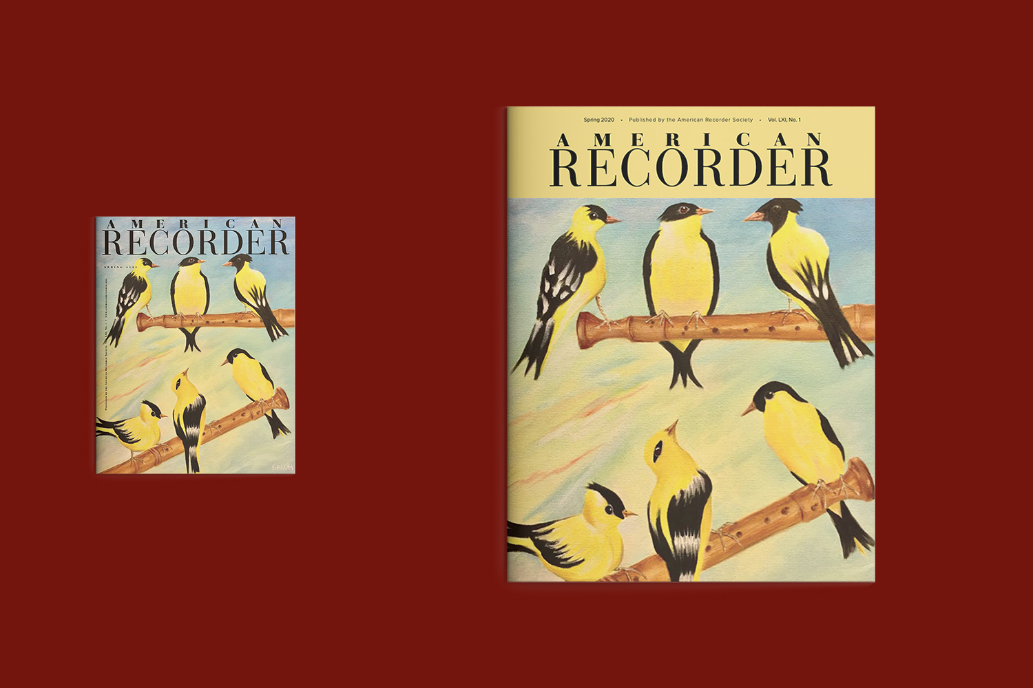
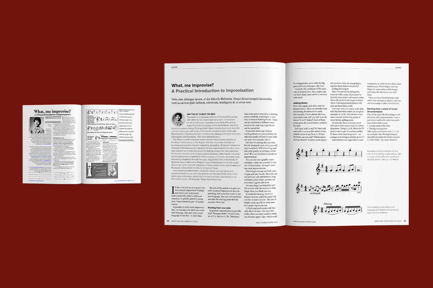
Redesign a quarterly print magazine that had not been modernized in over a decade.
THE BRIEF
The goals for this project were multifaceted, seeking to accomplish a publication that would be attractive and inviting to its 2,000+ (national and international) member base; including appealing to current members (aged 50-79), but also attracting a younger adult audience. A new look needed to be established, one that would be more practical, less esoteric, and enhance the readability and multigenerational appeal of the publication, while also improving the layout and structure to make the piece easier to consume.
EXECUTION
I built a strong foundational knowledge of the publication by reviewing reader surveys and past publications (taking note of the existing stylesheet, layouts, naming conventions, structure, creative approach, and design perspective). I also worked closely and collaborated with the editor, board members, and staff throughout the project.
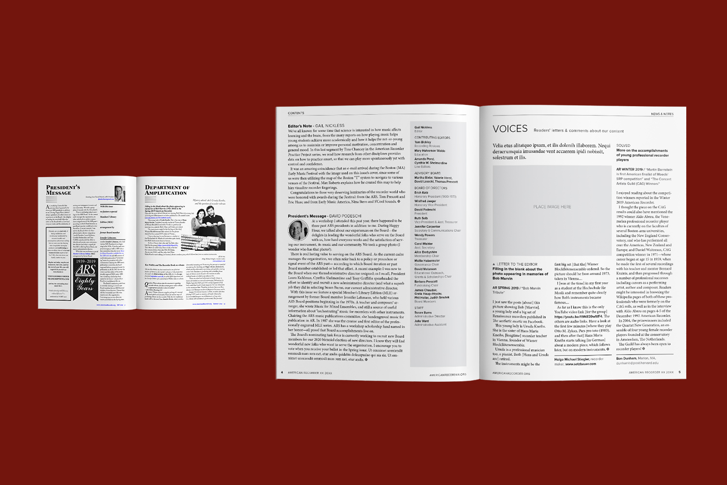
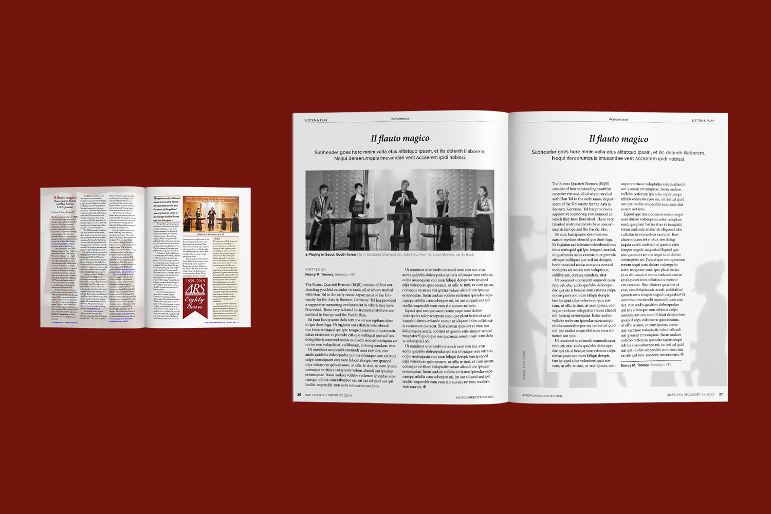
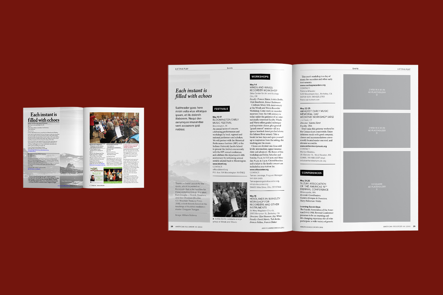
To provide solutions for all the communicated pain points, I designed layouts that would accommodate the different types of content and scenarios, allowed for the restrictions and limitations of both producing and printing, and provided an improved organization to the overall structure and content. My purposeful design included a revised table of contents, redirecting ads to be less intrusive to content, and creating a stylesheet and hierarchy for different elements, such as photo captions and author bios, titles and subtitles, titles and stand firsts, word counts, photo treatment and placement, pull quotes, and callouts.
PROJECT ROLE
Contributing Art Director
2020
So glad to have hired Emily for our magazine redesign! She was great to work with and offered many design ideas that improved readability and modernized the look of our publication. She completed high quality work on time, and remained cooperative, communicative and available throughout our project.
– American Recorder Society Board Member


